Thursday, July 31, 2014
Reflection
I enjoyed session 2 of summer school. I had fun in Michael's class. I learned about the different genres of art that there are. We went on a few different museums thoughtout the city. My favorite museum was the Moma and the Guggenhiem museum. I learned that art could be anything you want it to be. My favorite type of art is land art which is conceptual and Art Deco, which is decorative. All though it was fun, it wasn't always a simple class. The most difficult thing that I have learned in class is about Postmodernism. I Learned the different types of postmodern texts that there are, like Irony and Parody. I also learned that family guy intertwines with postmodernism because the show shows different scenes in which postmodernism is portrayed. I am grateful that my teacher took the time to teach us all of these things. The things we've learned, like postmodernism is a topic that will be taught in college. We read an article of the 7 different postmodern texts. It was so complex that it is at a college level comprehension. A final thing I enjoyed in class was making daily blogs. I've always wanted to make blogs and thanks to my teacher, I did just that. I hope you all have a great summer. Ciao.😁✌️☀️
Guggenheim Museum- Shapes
I created my shapes with clay because I wanted to try something different. I got inspired by the shapes exhibit at the Guggenhiem museum. I loved the material and colors that were used. I chose one simple color to show that even though there are different shapes, the shapes are still the same color. That makes them the same inside and out, even though they're different shapes. That's my concept of it.

Family Guy - Postmodern Text
I think Family Guy is postmodern when it comes to irony and parody. Today we see a lot of postmodernism on today's television, especially in the comedy genre. Postmodernism is characterized by ideologies and and theories. Since postmodernism is mostly common in the genre of comedy, Family Guy is a perfect example of postmodernism.
All of Family Guy's episodes are about making fun of another show or person. The only difference about making fun of other shows is that they put their own twists to it. That shows the parody of the show. For instance, when Peter and his son went to the Jewish people because Peter needed financial help and in a stereotypical sense, Jewish people are good with money. Postmodernism always concerns itself with undoing gran narratives. In this case, America always stereotypes Jewish people with being financially stable. .Moreover, in Family Guy, the scenes go from one to another. For instance, when Megan needed glasses and started explaining to her mother that she doesn't want to get laser surgery for her eyes; the scene then changed to Star Wars and the laser stick the characters use to fight. The point of that scene was to shows that the laser stick was being inserted into someone's eye as if giving them laser eye surgery. That shows parody as well.
All of Family Guy's episodes are about making fun of another show or person. The only difference about making fun of other shows is that they put their own twists to it. That shows the parody of the show. For instance, when Peter and his son went to the Jewish people because Peter needed financial help and in a stereotypical sense, Jewish people are good with money. Postmodernism always concerns itself with undoing gran narratives. In this case, America always stereotypes Jewish people with being financially stable. .Moreover, in Family Guy, the scenes go from one to another. For instance, when Megan needed glasses and started explaining to her mother that she doesn't want to get laser surgery for her eyes; the scene then changed to Star Wars and the laser stick the characters use to fight. The point of that scene was to shows that the laser stick was being inserted into someone's eye as if giving them laser eye surgery. That shows parody as well.
Tuesday, July 29, 2014
Inspired by Robert Smithson
This drawing resembles Robert Smithson's concept of mirrors. The drawing is a person looking at their reflection instead of looking into a mirror while still surrounded by nature. The person is looking at her reflection and at the same time she sees her place in the environment. The birds in the sky and the fish in the sea resembles nature. Even the sun setting and the sea all resembles nature.
Check out my prezi
Check out my Prezi on conceptual art at:
http://prezi.com/o0axmrxa7scm/?utm_campaign=share&utm_medium=copy
http://prezi.com/o0axmrxa7scm/?utm_campaign=share&utm_medium=copy
Monday, July 28, 2014
Whitney Museum - Pink Cake
This drawing I drew resembles the cake I saw at the Whitney museum. The pink construction papers represents the color of the cake, which is pink. I chose this art piece from the Whitney museum because pink is one of my favorite color. I also thought it looked really fun and classy. I got the vibe of elegancy. So that's what my drawing is inspired by.
Bronx Museum- Caribbean house
This drawing represents an art piece that I saw at the Bronx museum. Houses in the Caribbean are built from cement because in the Caribbean there's a lot of hurricanes. This art piece spoke out to me a lot because I can relate. Back home in Puerto Rico, I have my own house. My father and some others helped construct it. My house looked exactly the same as the art piece when it was being constructed at first. When I was an infant my granddad told my father to make me a house and so that's what my father did. Till' this day it's still there. Now it's nicely constructed and finished. It's two floors.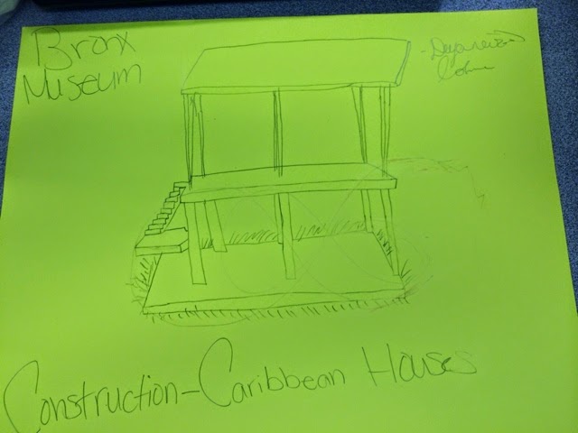

Wednesday, July 23, 2014
Moma Museum - my dream city
I drew this because I know what it's like to live in a city. A city usually has a lot of buildings. Growing up in the city there's a lot of cars and it's just really crowded. Also in the city there's an incredible Amount of pollution. Now, the reason why i wrote those words down is because despite it all, I love this city because I've been here all of my life. The artist that I was inspired by was Giorgio de Chrico because in his pieces he uses many things at once. He used a lot of material things. But I also like liked his art piece because there are many things clustered at once and that resembles my drawing. Because in a city, there's always so much going on.
Independent reading
The book that i'm reading is about a high school student who commits suicide. Before doing this she records herself on a set of old cassette tapes explaining 13 reasons why she decided to end her life. She then decides to send those tapes out to each individual who was the cause of Hannah Baker's death. Moreover, a boy named Clay Jensen who is the narrator in first person point of view, is on one of the tapes and he tries to figure out what he did to be on one of the tapes. Because him and Hannah shared a kiss the night of the party. He actually really liked her and had respect for her unlike other people.
The chapter that i'm currently on is about Hannah explaining on one of the final tapes how she has her mind made up about wanting to end her life. She had too many bad things happening to her at once that she just felt she could not cope with any longer. She also felt that she just didn't have a friend to help console her. She went on explaining on how she decided to end her life. She overdosed on pills. All this makes Clay feel worse because there he is listening to a bunch of tapes and hearing Hannah explaining on how she wants to end her life and why. This makes him sick because he truly cared about Hannah and he feels heart broken at the fact that she decided to end her life. He felt closer to her through the tapes


Tuesday, July 22, 2014
Pop art "diabetes soda"
This is a pop art piece. Well at least it is to me. I got the idea from a soda can. The concept of this is that too much soda is unhealthy and can cause diabetes. The point was to make the soda imperfect because once diabetes ruins with your health, your body becomes less and less perfect. I wanted to add the cheetah prints just because it's my favorite animal print. Instead of labeling the soda " Pepsi" or " sprite", I labeled it " Diabetes."
Monday, July 21, 2014
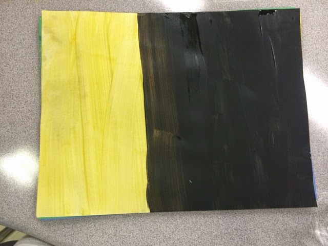
The concept behind my art is that the yellow represents a human's good side and the black represents a human's bad side. Now, the reason why there's more black than yellow is because us as imperfect human beings, we're bound to have more of a bad side than having a good side. I used the yellow as a person's good side because it's a bright color. I used black as a person's bad side because it's a dark color and a dark color can be represented as a person's dark side. I believe that colors have a lot of meaning in art.
Subscribe to:
Comments (Atom)


.jpg)
.jpg)
.jpg)
.jpg)


.jpg)